Brand-new Management Experience
New Storage Manager makes it easier to troubleshoot, monitor, and maintain your CSD
Storage Manager is an indispensable app of the main product - a cloud storage service. Users mainly use it when changing the storage configuration or when the status is abnormal. Although it is not frequently used, we received about 1.5K support tickets from users per year, and over 70% of support tickets are about usability issues. Therefore, our goal was reducing the number of tickets and building a better user experience.
To cooperate with the project members, I studied the technical terms and domain knowledge about storage by reviewing online help documents and existing features.
I reviewed the current flow and user interface and summarized the UX issues from support tickets for improvements.
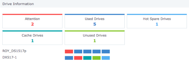
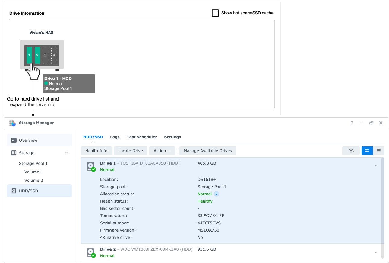
1. Hard to find the physical location of hard drives
I found from support tickets that many users had encountered difficulties when replacing hard drives. The broken hard drive is shown on the Overview, but users did not know which one should be replaced on their device.
“ Drive ID:5 is damaged, how can I identify the location of this drive in the appearance of the NAS? ”
From Support Ticket A
“ I want to replace a drive with bad sectors. How do I know the location of this model of drive? ”
From Support Ticket B
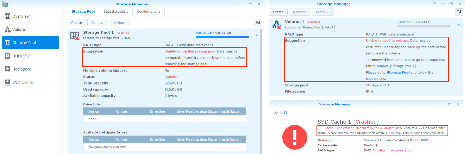
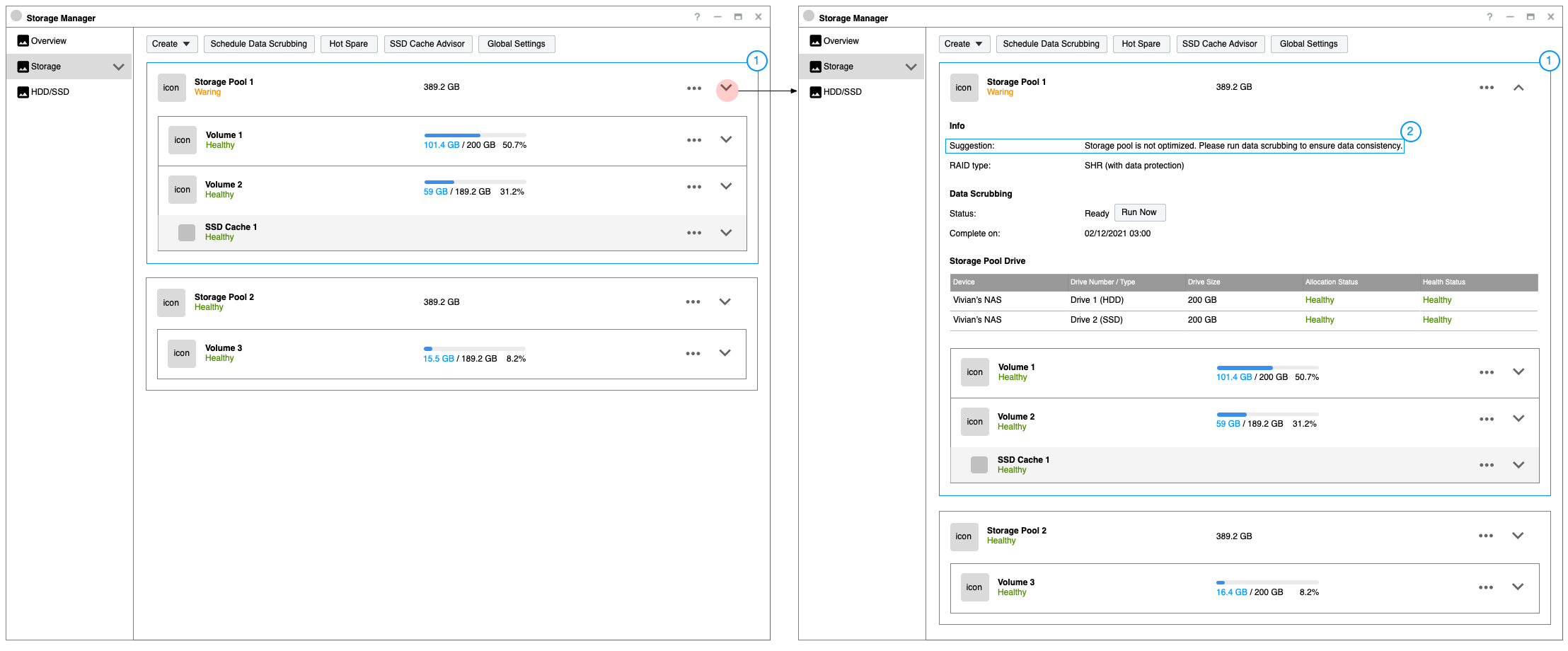
2. Hard to follow multiple suggestions
After I reviewed the current flow and user interface, I found that when a hard disk is broken, multiple suggestions will show on different pages. Users need to switch between multiple pages to understand the problems, and It is hard for them to know what to do first.
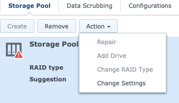
3. Disabled options make users confused
We received a lot of support tickets that some functions are gray(disabled). Since there is no explanation at all on the screen, the user does not know the reason.
4. Unclear Explanation
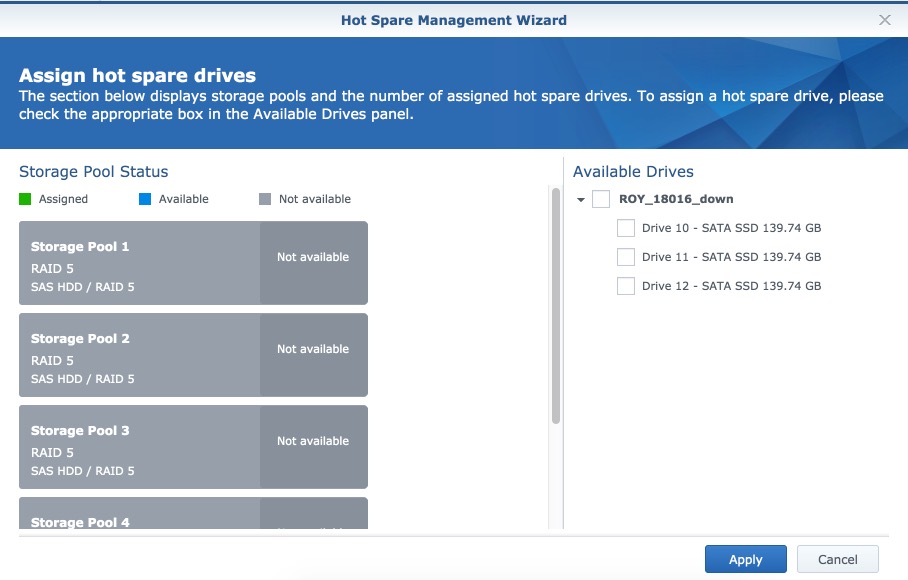
When users want to configure a backup hard drive to protect the storage space, the screen just shows “Not available” without explanation. Users may not know the reasons.
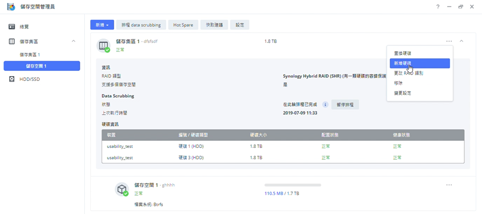
I surveyed the below competitor’s storage management interface and compared the information, interaction, and layout they presented.

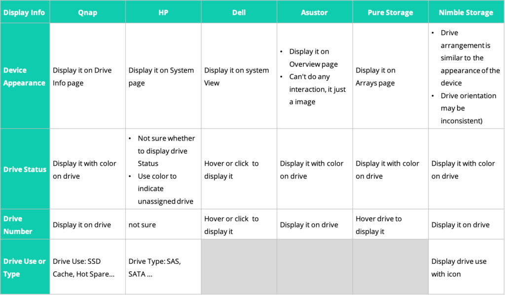
I found that:
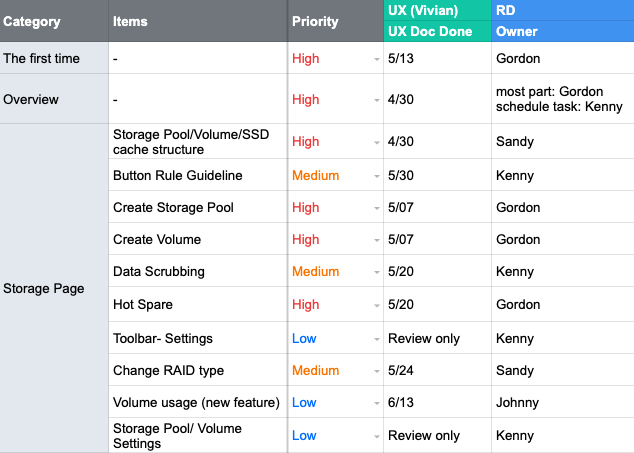
To confirm the scope of the redesign, I listed the flows and functions which have usability issues and discussed the priority and timeline with the PM. Because the redesign needed synchronized work across multiple development teams, I also recorded the owner of each task for follow-up discussions
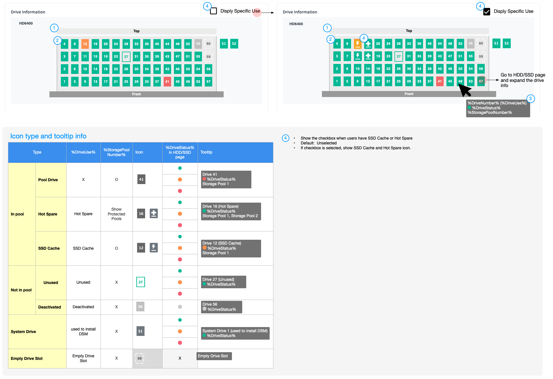
To solve the problem that the current user interface is hard to map the physical location of hard drives, I made the following design changes:
The old interface shows multiple suggestions when problems occurred, which confused the users. To solve the problem, I made the following design changed:
When users want to set a backup drive, the old interface didn’t show an explanation about the unavailable storage space. To solve the problem, I made the following design changed:
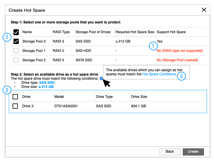
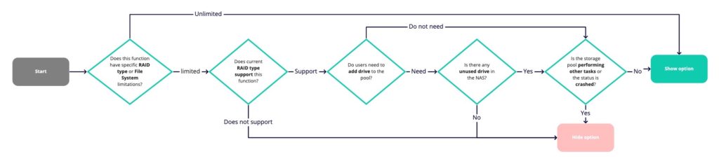
Lots of grey options on the old interface make users confused. So I defined the guidelines about when to show, hide, or disable options under specific scenarios.
To make it simple, I visualized the guidelines into flows for team members:
I redesigned multiple flows and layouts, but some environments are difficult to be reproduced in usability tests (e.g. some conditions are only triggered by specific hard drive status). Based on those limitations, I primitively verify the following two topics:
1. Can users find the physical hard disk location by viewing hard drive info on the Overview?
2. Can users find the specific functions of each storage space?
The user feedback about other designs will be collected after the beta version was released.
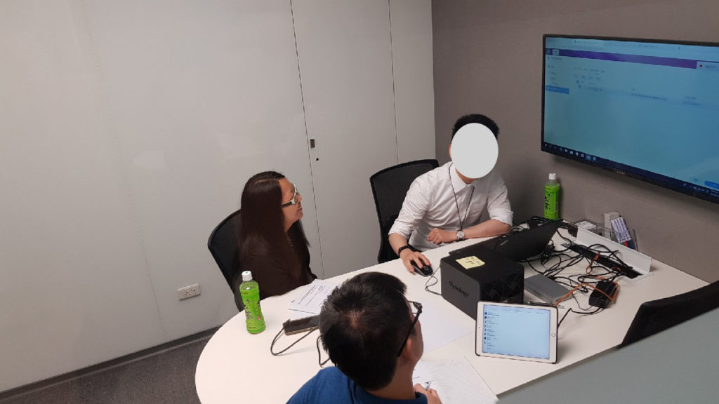
I managed the schedule and co-worked with developers and writers to complete the testing version. Due to the time limitation, I planned to host 5 usability tests in two weeks.
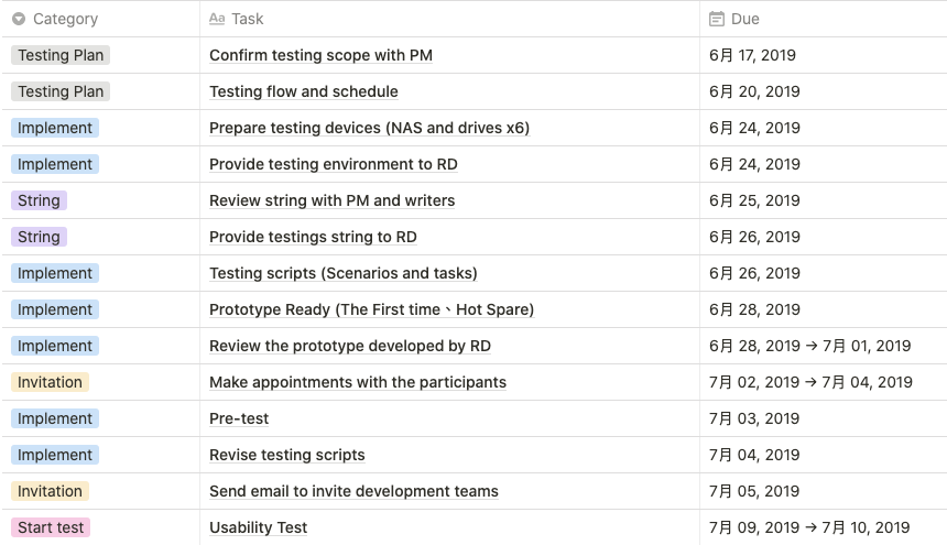
I wrote a testing script including the testing process, subjects type, questions for confirming their background, and testing tasks. Then I invited 5 subjects who own personal NAS (a CSD with the Storage Manager). Three subjects with basic knowledge and two with advanced knowledge of storage.
Because the engineers did not have time to finish the entire test version, I made a high-fidelity prototype to complete the test flows.
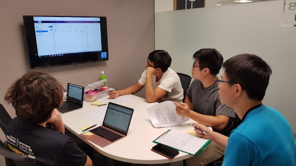
When I conducted tests in the interview room, the rest of the members - RD, PM, QC, Writer, and Support, recorded usability issues in an observation room. After each usability test, all members recorded the top three usability issues on post-its and we categorized these issues into groups.
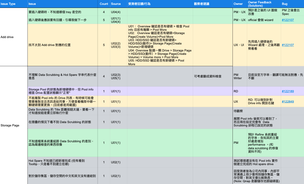
Recorded issues that resulted from strings and designs. The strings are revised by the writer after our discussion. The main problems of the design:
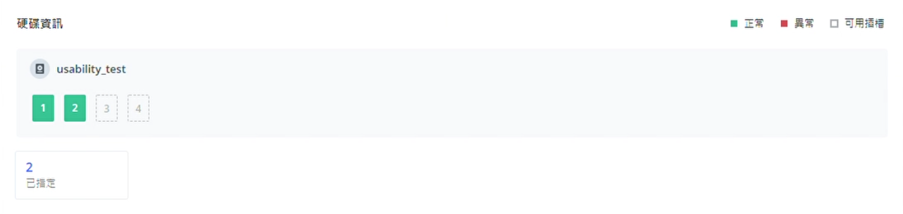
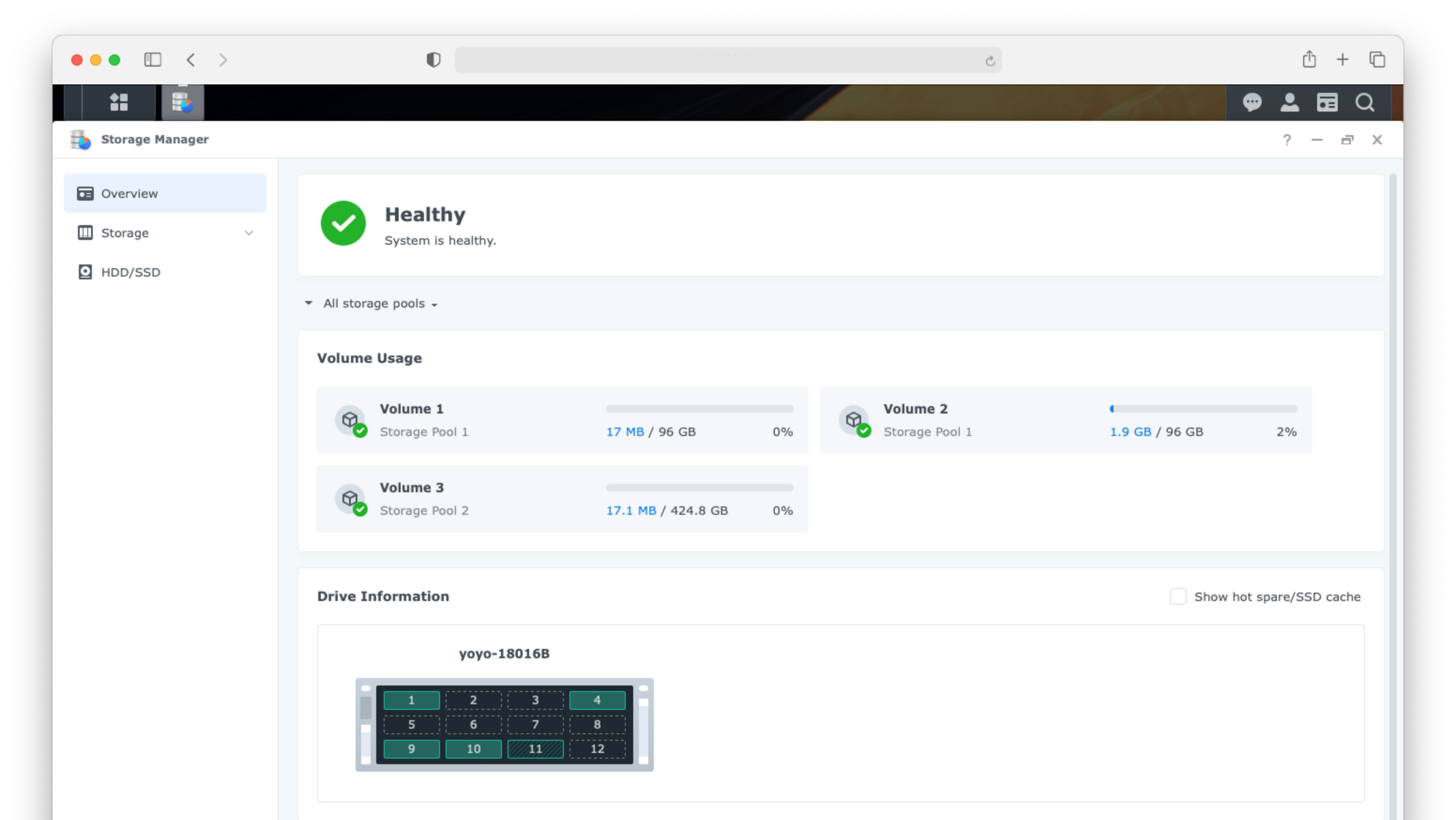
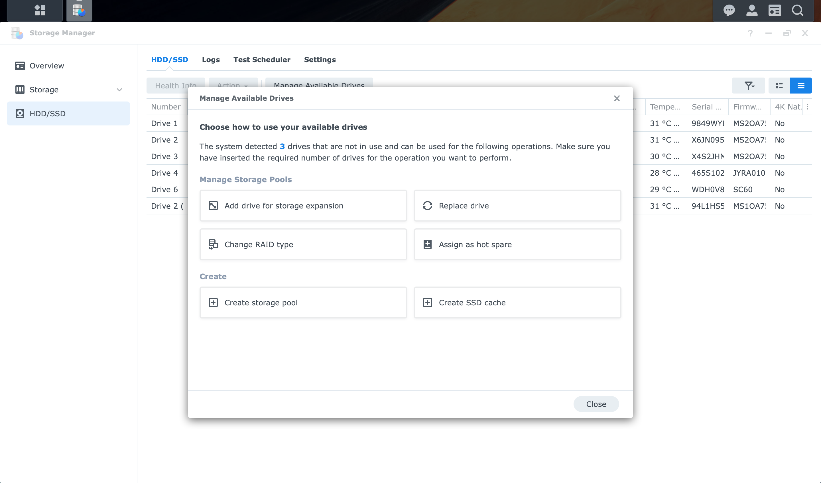
Design Change: Combined the hard drive number with the device’s appearance. Users can find the location of hard drives based on the image and hover or click the block(hard drive) to see more information.
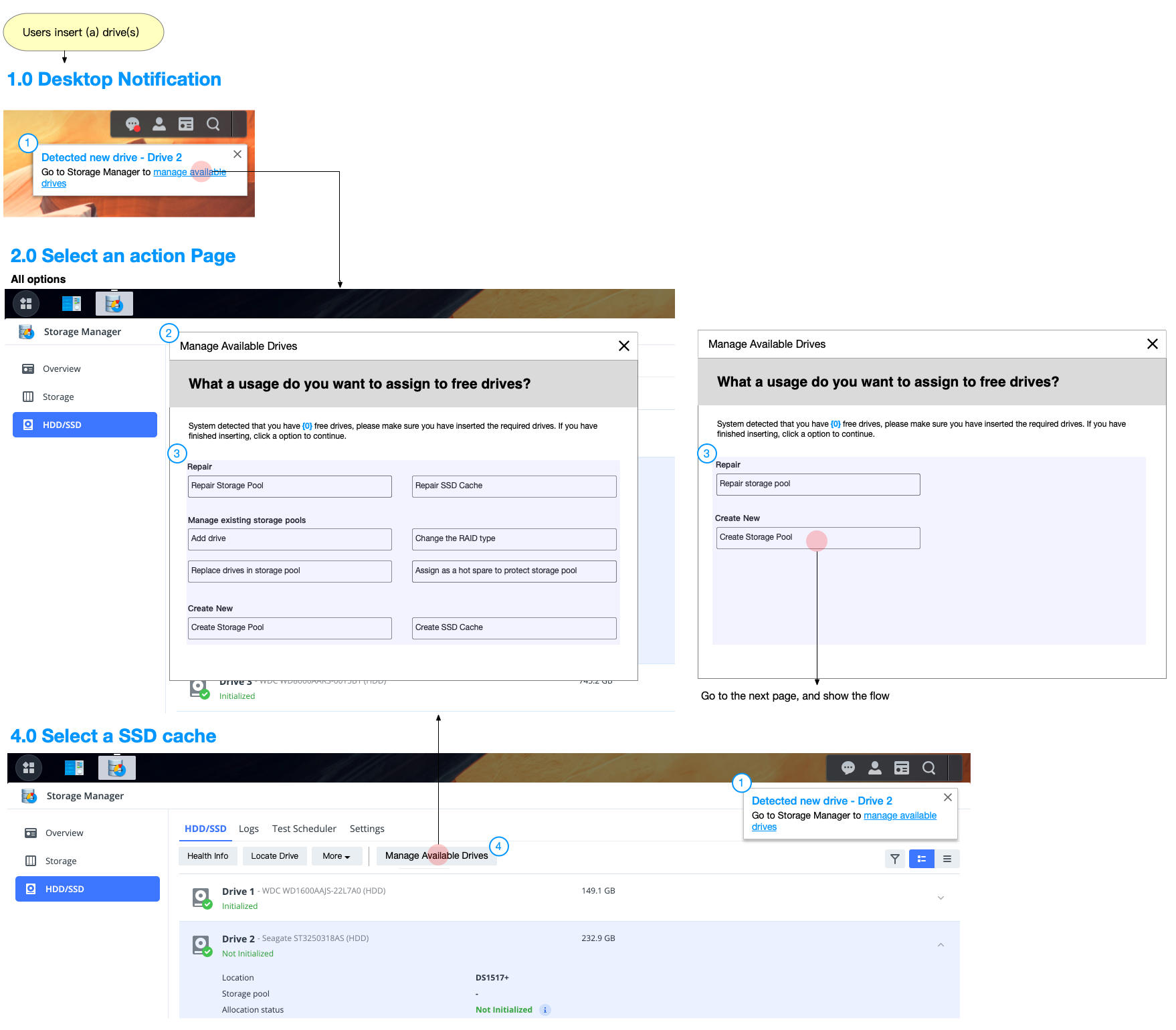
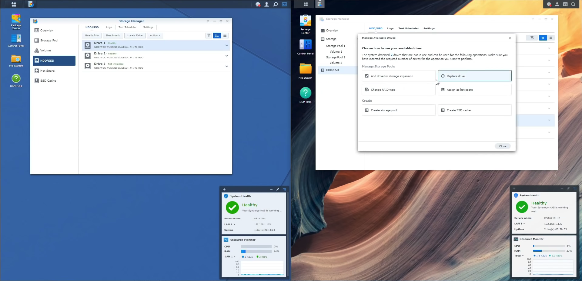
I designed new user flows: inserting hard drives will automatically trigger the notification which guides users to the wizard for managing available drives. Therefore, users can quickly find the action they want. Users can also open the wizard by clicking a button on the drive list.
We reduced the number of support tickets by 40% (about 6K tickets per year), saved a lot of labour costs for the company, and the new feature designs based on business strategies also drove over $28.6 million in revenue in 6 months. In addition, we received positive feedback from many users, bring a better user experience to 7 million users successfully.
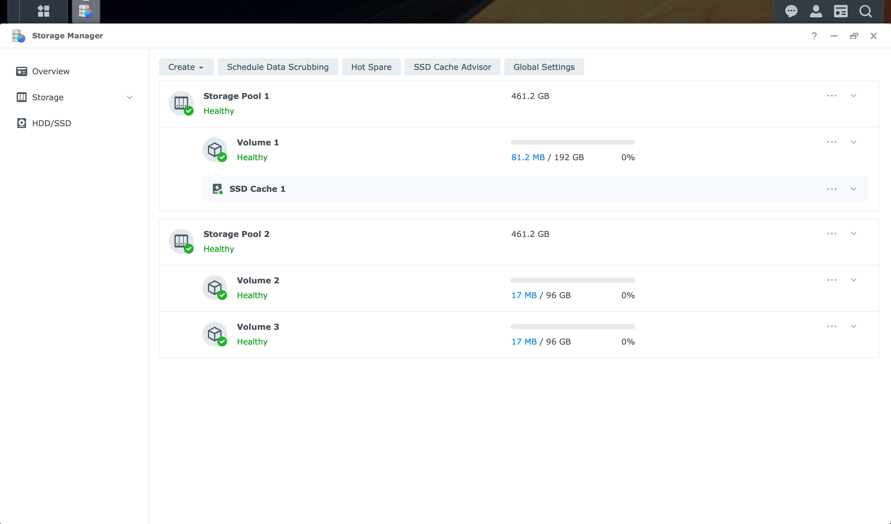
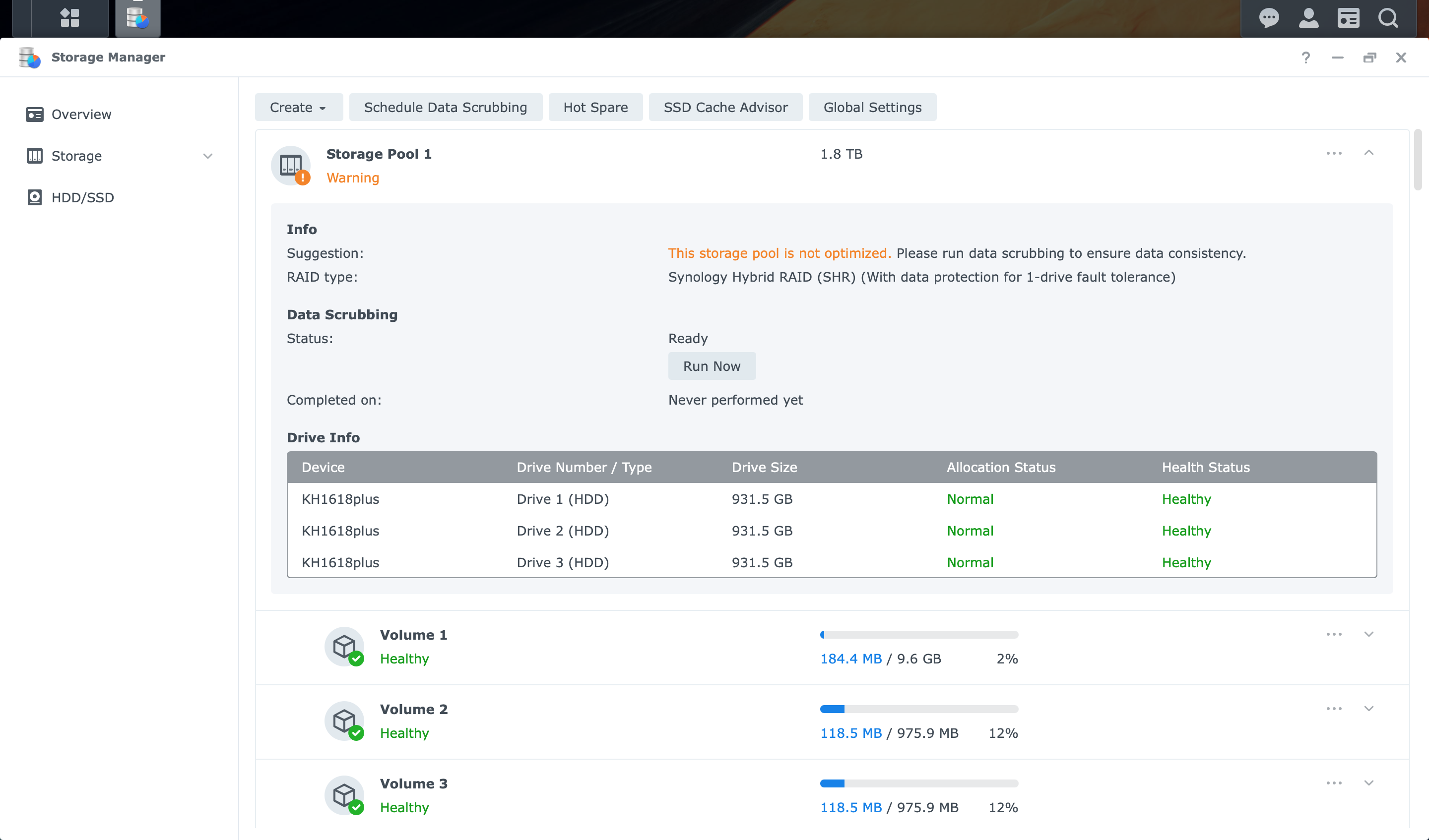
See at a glance storage status, organization and allocation of hard drives through an informative interface.
Consolidated multiple tools and pages to a single unified control center.
Reduce the support tickets by enabling context-sensitive self help suggestions.
After inserting a hard disk, select the purpose of the hard disk through the wizard, and quickly complete the configuration.
Hot-swap your backup drives for uninterrupted service.
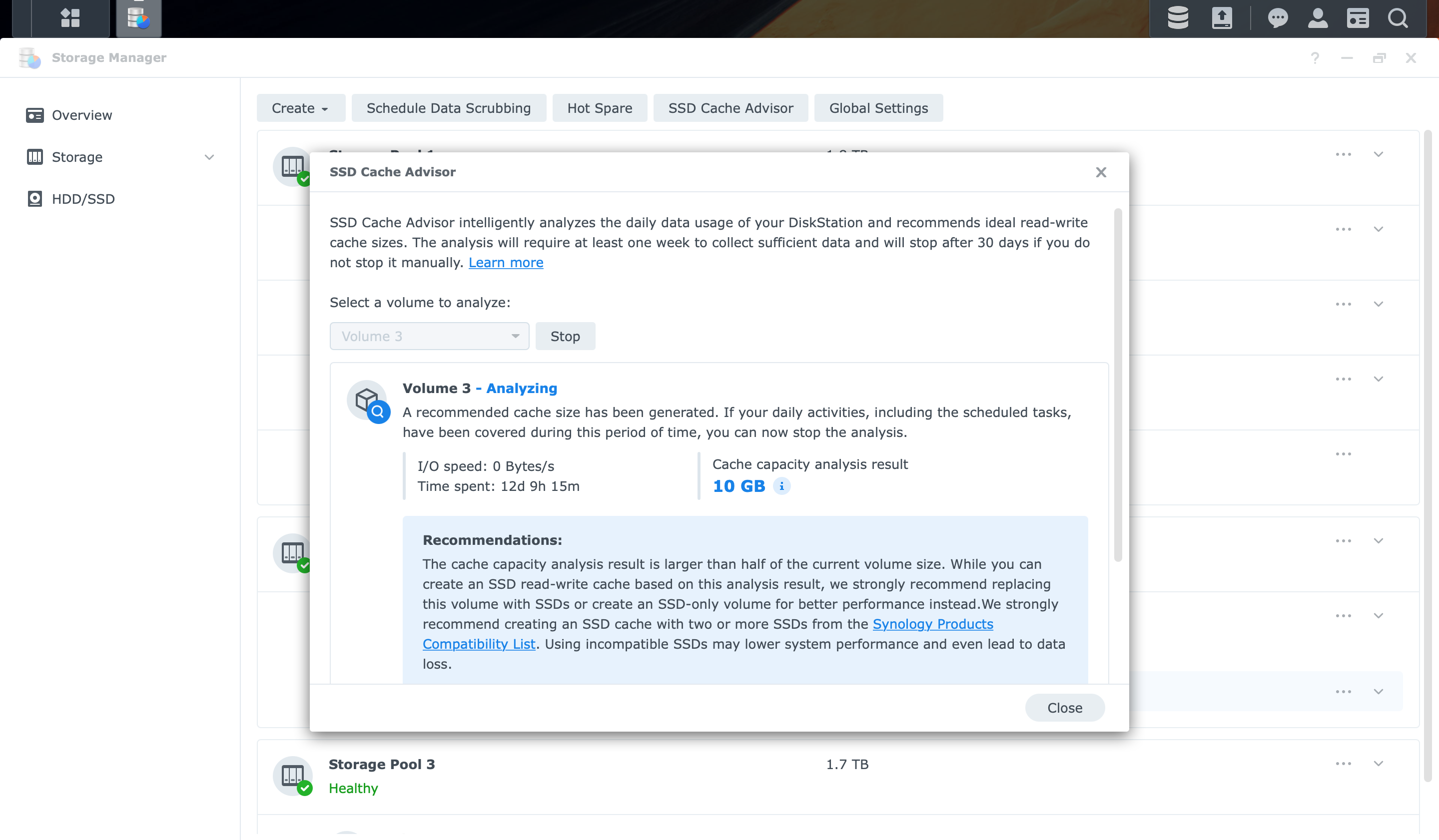
Only buy the cache size you need. Our system will recommend your optimal requirements based on your daily use patterns.
" I really like this. This is just a nice enhancement instead of labelling base or knowing which one it is. I think they did a nice job. Overall feeling of the same but more polished which is what I like this is a nice easy transition into a newer more modern interface without having you go oh crap I have learned a completely new product "
From user review video
” It shows you so much easier this is which bay is which because it nows gives you the direction because it is so much nicer and you can just click to go the drive you want quickly. You can think everything so much easier and I think it just makes this all so much more clear. “
From user review video
" I remember when I first time started out the old version, there was something called a volume and then there was a storage pool and I really had no deal what the difference was between them and it was always really confusing. Now, it’s just one single tab and shows you that you two different things I think that will really help people understand with it especially when they’re starting now. "
From SpaceRex Youtube video
From Synology Community
" This context menu of the storage manager I quite like this. If I was using a traditional SSD 2.5 SATA or I was using a hard drive, it would be great to be able to assign these nice and quickly as well as some of those options that are more proactive. "
From Robert's Youtube video
To convince 7 stakeholders, I became familiar with the domain knowledge of storage and user scenarios of the IT world through interviews and online courses. I also proactively shared insights and presented designs in a logical manner to show my expertise. This way, I built trust with the project members and communication between us became smoother.
To complete the test version, I co-worked with developers and writers. I learned how to plan and evaluate the schedule of the usability test like a PM. Moreover, I organized the parts that could be improved and shared them with the design teams to make further tests smoother.