Finance Management Project
Maximize revenue by pricing projects to reflect true resource and time costs

In 2022, our product underwent a rapid rebuild to address technical issues. However, user feedback revealed logical inconsistencies in our flows, leading to client churn and increased support demands, negatively impacting our business. Additionally, the absence of scalable and reusable components slowed down developer processes, alongside persistent design inconsistencies and accessibility issues, which hindered the user experience.
As the lead designer in our agile environment, I define our UX vision to provide alignment and direction. This vision aims to address user concerns, streamline development, and enhance our product's accessibility for sustained success.
Design a cohesive and intuitive interface that provides an accessible and engaging user experience, enabling users to efficiently complete key tasks.
Refining the UX vision into actionable design goals, we aim to:
Enhance the user experience by ensuring that information is presented in a clear and accessible manner. This includes improving aspects such as contrast, readability, and information density.
Simplify interactions and processes within the design system to boost user efficiency. By reducing complexity, our goal is to streamline workflows, making it easier for users to accomplish tasks effectively.
Elevate user satisfaction by refining key interactions. Additionally, ensure consistency across projects by reusing interactions, and maintaining coherence and familiarity for users.
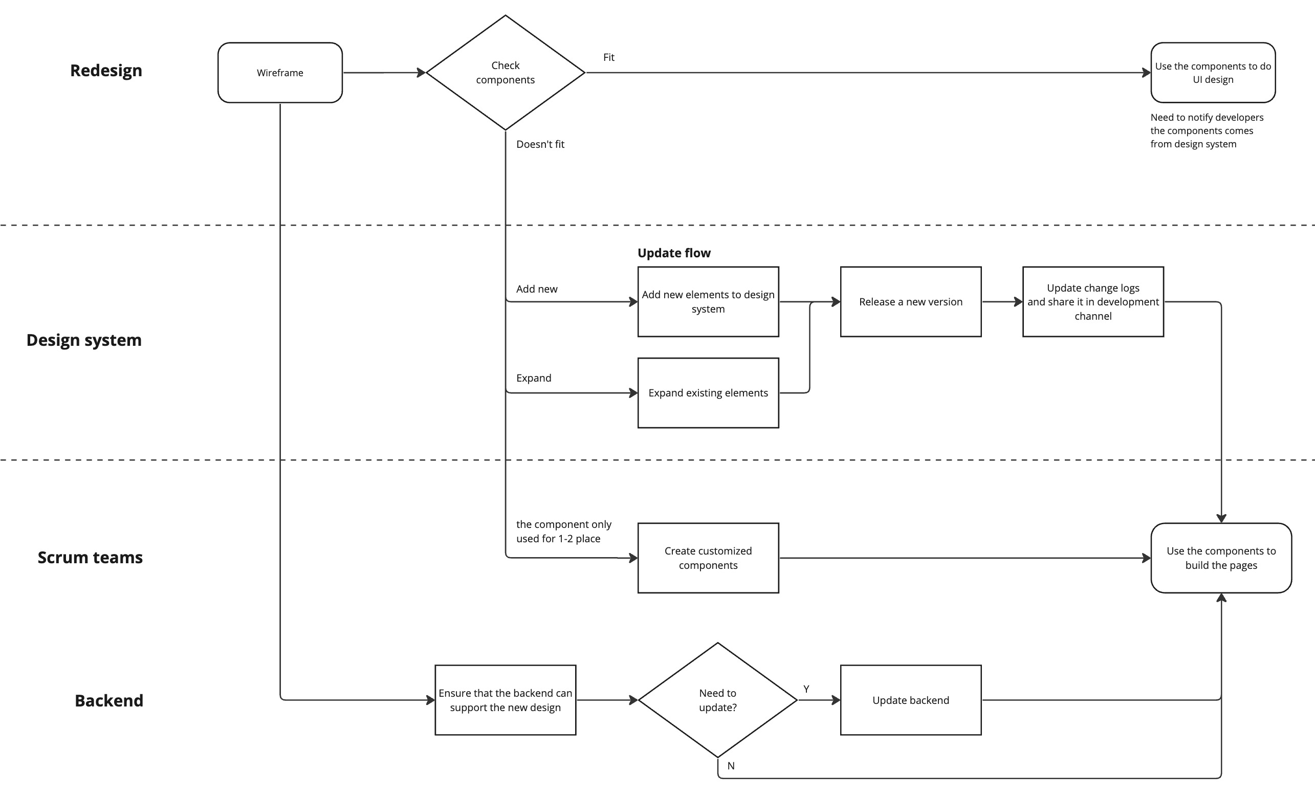
After receiving encouraging feedback from the CEO about the redesign concept, we forged ahead with implementation. I teamed up with the CTO and Engineering Manager to strategize our approach. We settled on a modular strategy and rolled out modules as they finished. This gradual release lets users ease into the new design, preventing any sudden surprises. I then crafted workflows and collaborated with the Scrum teams and backend developers to ensure smooth execution of the plan.
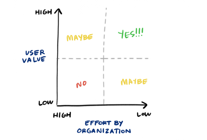
To kickstart our redesign process effectively, we need to choose where to begin wisely. Following our strategy of promptly showcasing our value to users, I implemented a method to prioritize modules.
Firstly, I analyzed our data to determine which modules are frequently used by our users, prioritizing based on value. This helps us pinpoint areas with the most significant impact.
Secondly, I assessed effort and complexity by creating a sitemap and engaging in discussions with Scrum teams. This allows us to focus on modules that offer substantial value with relatively less effort required for redesign. By employing this approach, we ensure that we efficiently address the most impactful modules and swiftly deliver value to our users.
By employing this approach, we ensure that we efficiently address the most impactful modules and swiftly deliver value to our users.
%20(1).png)
To align with our goals, I mainly concentrated on these improvements during the module redesign. I finished 70% of the core modules, while a new designer handled the rest. Working closely with her, we pinpointed areas where our design system needed expansion.
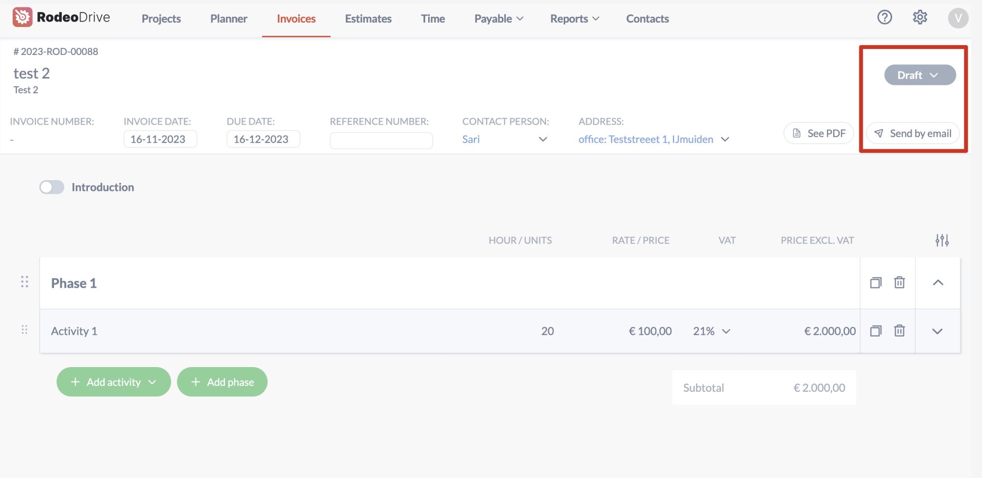
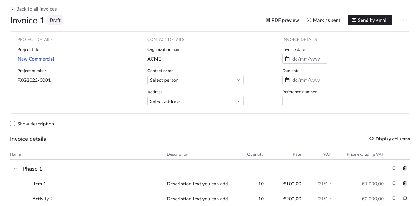
Consistent designs across various interfaces greatly reduce the learning curve for users. In addition to utilizing our design system, I've established guidelines for layout consistency. For instance, "Create" actions consistently align to the right corner, while filters align to the left.
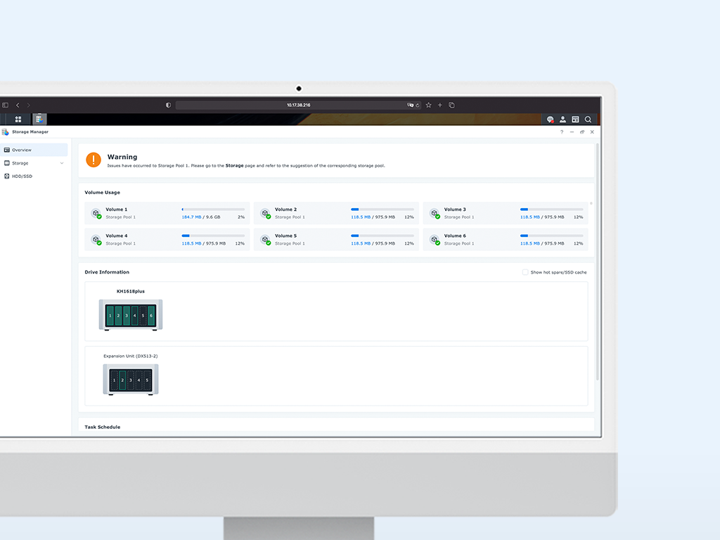
Excessive spacing and a horizontal layout in the expandable grid make finding information cumbersome. I used the side panel for easier scanning and efficient item switching.
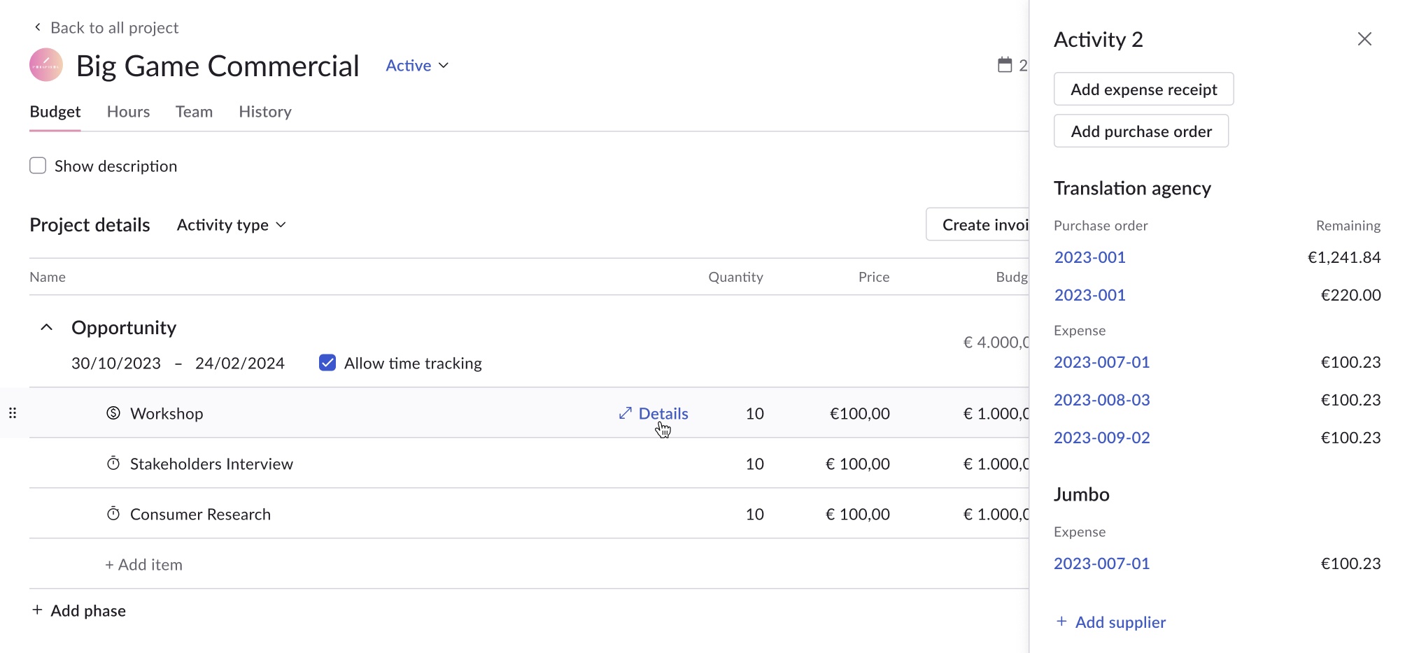
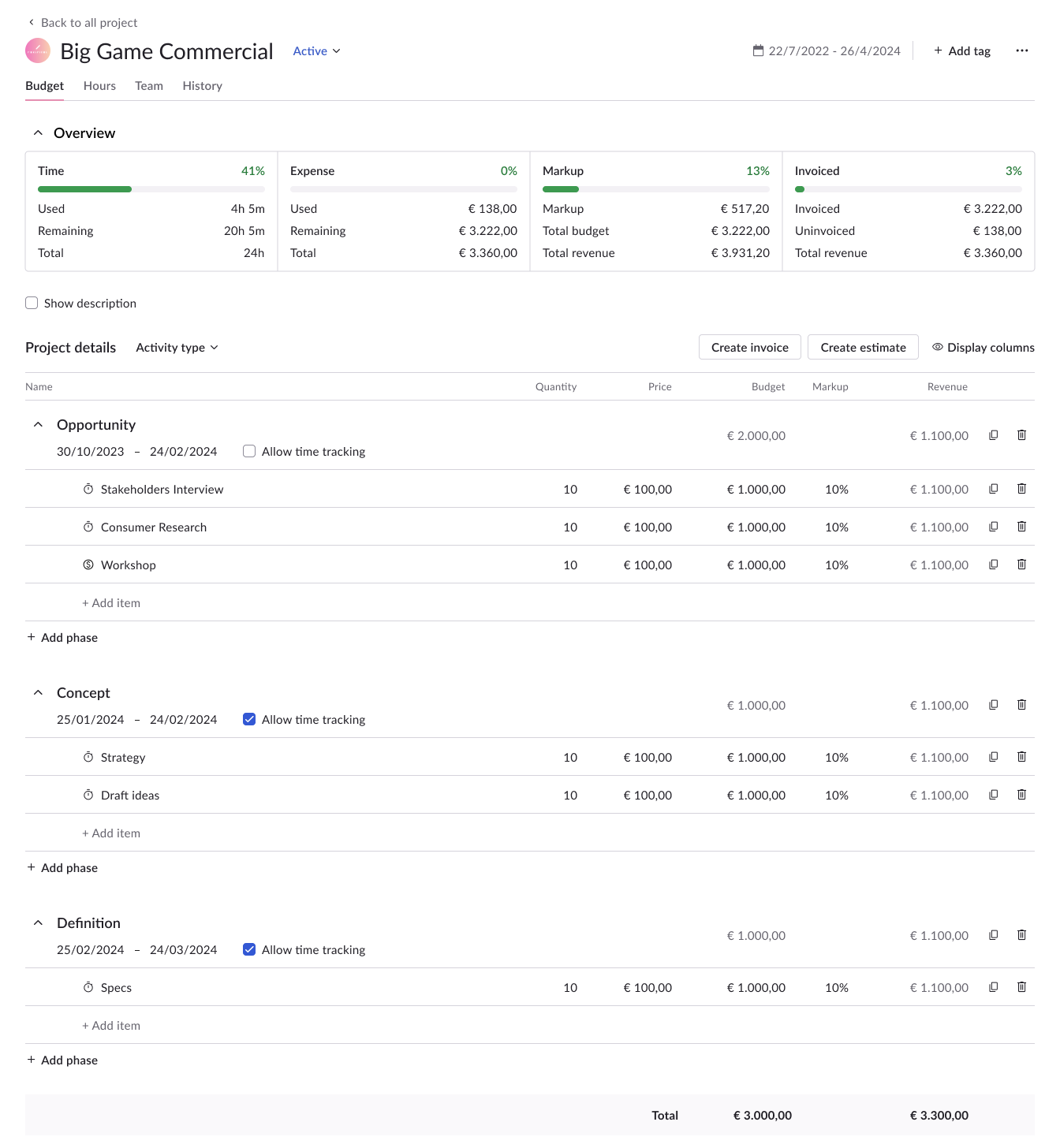
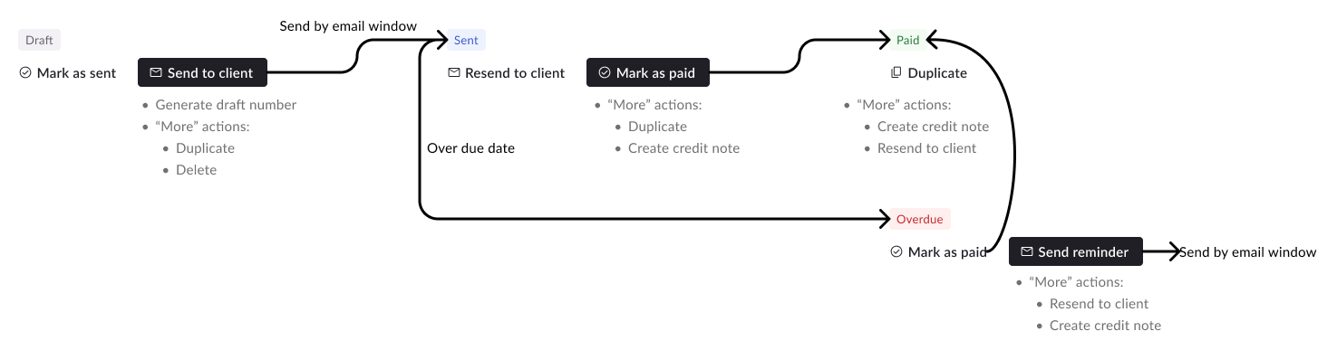
We received user feedback that they not sure what to do after completing an invoice estimate or purchase order. To address this, I added a clear prompt with the primary button, automatically updating the status based on user actions. This simplifies their process, letting them take action without switching statuses.
To initiate the design system, I conducted a comprehensive review of the entire product to identify recurring components. From this analysis, I compiled a list of components that appeared repeatedly. Subsequently, I collaborated with the design system team, comprising three developers, to refine these elements and generate implementation tickets.
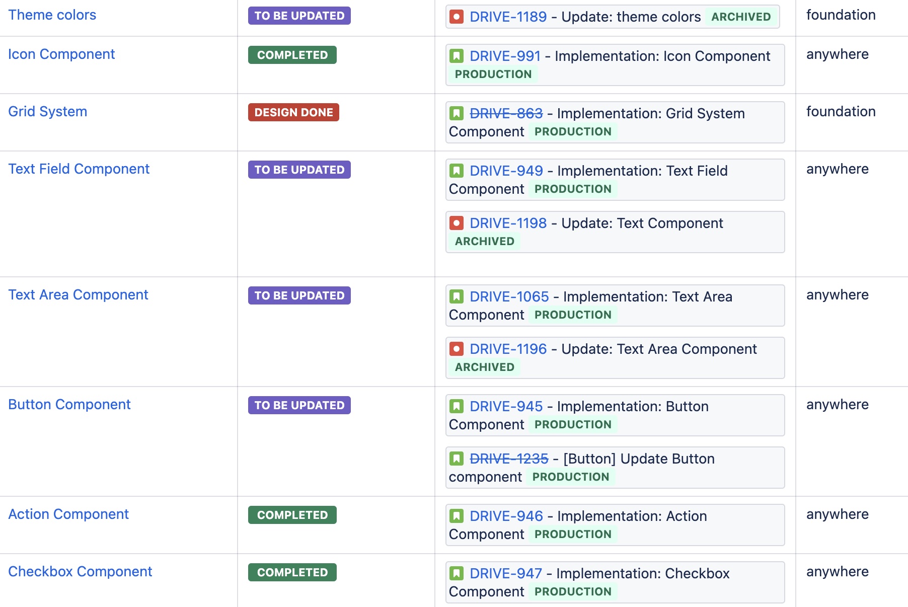
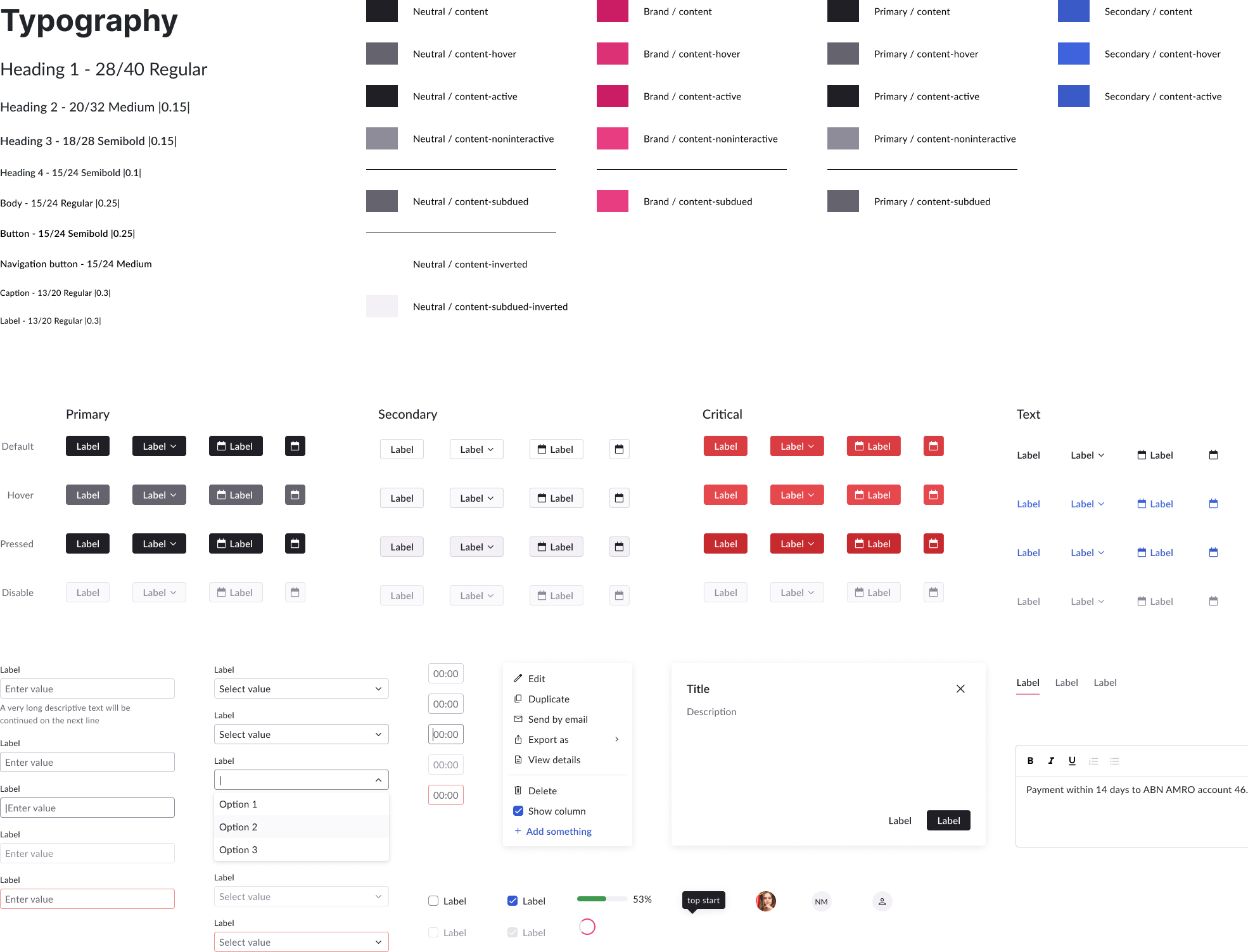
I began the process by prioritizing foundational elements like fonts and colors, drawing inspiration from our brand palette. Furthermore, I ensured that the contrast of texts and graphics adhered to WCAG 3 standards to enhance accessibility.
After establishing foundational styles and components, I focused on high-impact modules using the design system. Adapting to new behaviors and recurring components, I expanded the system. Upon completing approximately 70% of the components, I handed over the remaining tasks to another designer, enabling me to concentrate on the overall system redesign.
As we grew, we saw more new faces, which meant our teams and departments were becoming more interdependent. But with this growth came a lack of clarity on how our actions affected each other, leading to chaos. So, I formed small groups of the right people to talk about the things that mattered, avoiding those big, time-consuming meetings where not everyone needed to be. By doing this and creating multiple channels for communication, we got everyone on the same page and avoided surprises.
We encountered challenges in enhancing everything. Initially, I pursued many improvements and realized they consumed not only my time but also that of my colleagues. To manage this, I prioritized improvements aligned with our objectives and involved the team in scoping discussions. We aim to balance ambition and time constraints, ensuring the efficient delivery of high-quality results.